Ark
United Response – User-focused website showcasing the services of a leading charity
2020 – ongoing
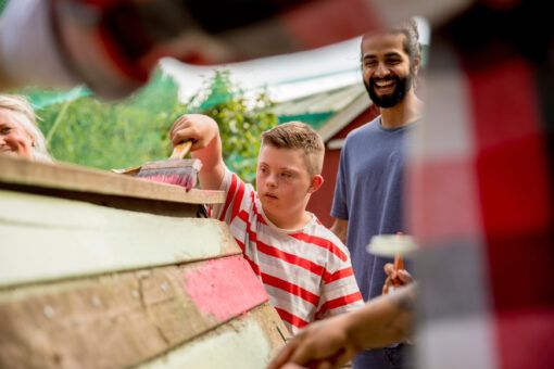
United Response is a charity committed to making life better for young people and adults with learning disabilities, autism and mental health needs.
A priority for United Response was to find a partner that would put users at the heart of their process. Through extensive consultation, we worked with them to build a new website that provides clear routes into services and helpful resources for practitioners.
Working with users to set priorities
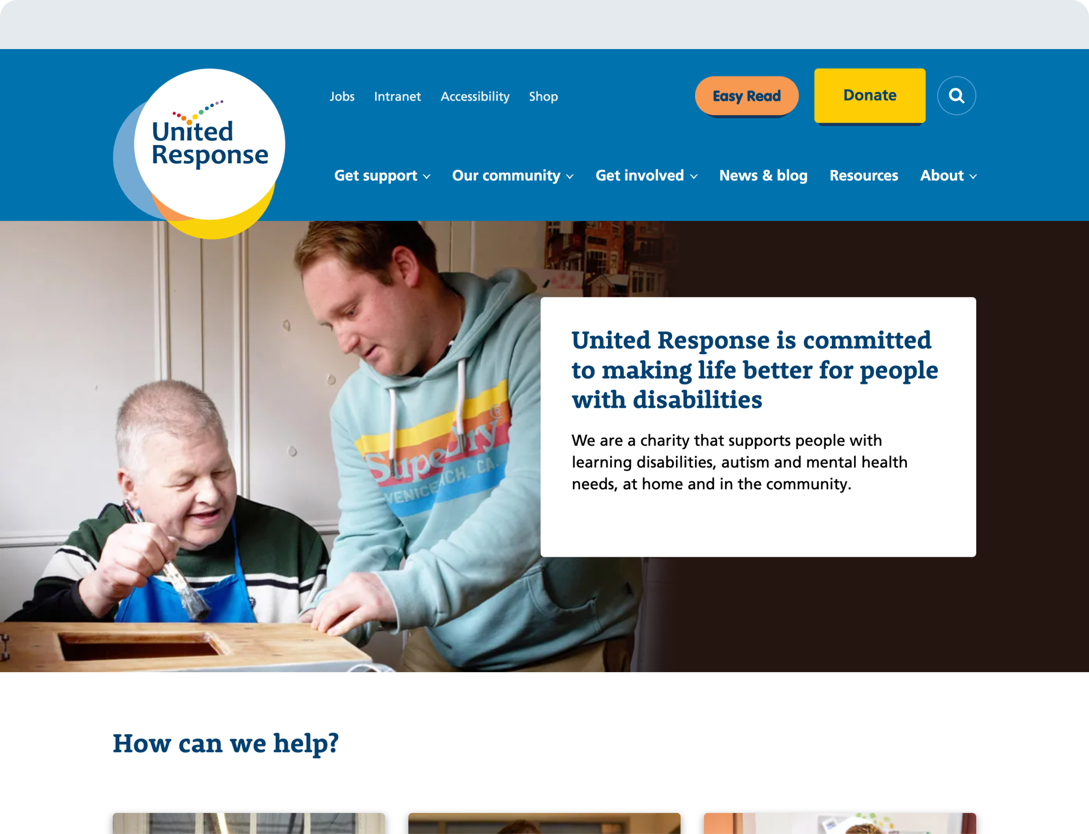
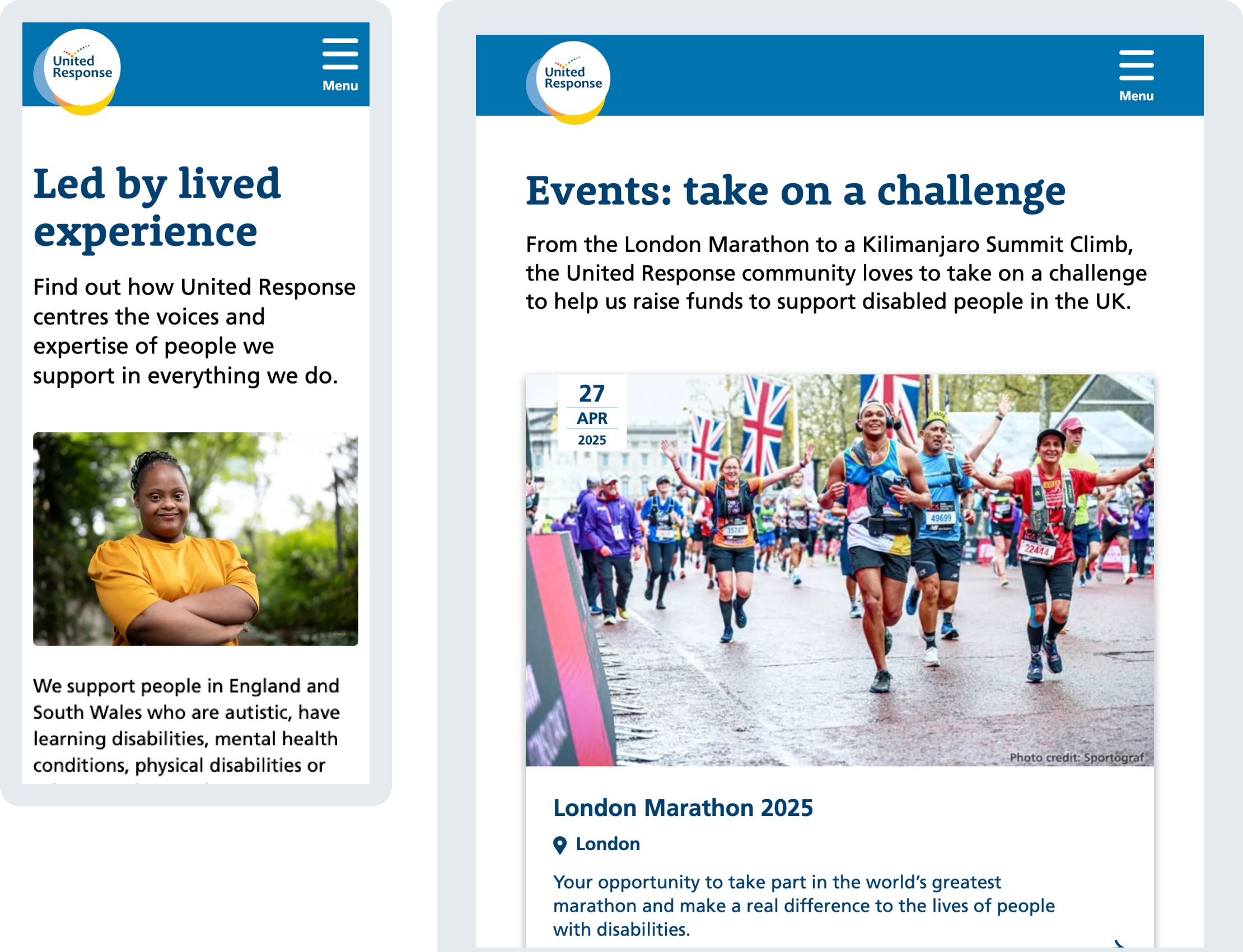
United Response wanted their new website to better support an audience that includes service users, professionals and job seekers. They also needed it to help them shift to a more localised approach to service delivery and build a sense of community for people with additional needs and their families.
The project involved extensive consultation, including interviews and workshops with people from across the organisation. We also spoke to users at the outset and throughout the project, including a dedicated design session for people with learning disabilities to explore their needs and preferences.
A structure that works for multiple audiences
Our conversations informed an approach to navigation and data structure that provided key information for professionals, families and supporters, while surfacing essential information and resources for individuals seeking support for themselves. The website includes a service map which links areas, service types and conditions and presents the information in a way that’s intuitive for users.
Following the main website build, we have also developed a dedicated jobs website and a microsite about politics and voting for people with learning disabilities.

A comprehensive approach to accessibility
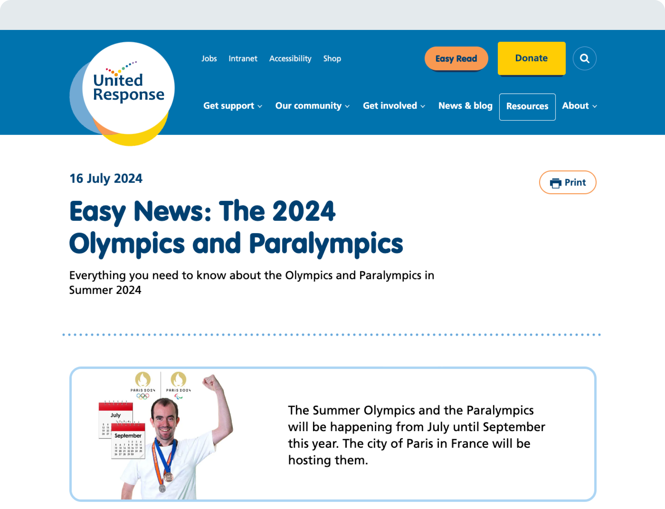
While the website meets WCAG AA standards, we took a broader approach to accessibility, using the workshops to identify the most inclusive and accessible approach to language and imagery.
A notable feature is an entire section dedicated to ‘easy read’ resources which provide a simpler and more visual approach for people with learning disabilities. Other aspects of the design draw strongly on this concept, such as explanatory images to provide context to navigation and headings. As a result, the new design is a more positive, honest and empowering expression of the brand.
The new website is just what we requested: it has a new look which feels more modern, with a clearer layout and a more intuitive user journey. Bureau helped bring our initial ideas to life, hosted workshops with people we support and key players around our nationwide charity, and delivered the site on-time and on-budget. It has been a pleasure working with them.